- Homeward Books
- Posts
- Chapter Three: Take a Dive into Book Design
Chapter Three: Take a Dive into Book Design
Homeward Books
October 16, 2025
Hello!
First: thank you so much for pre-ordering our first book, our cool merch, and our imaginary objects. (Yes, those links all go to our Kickstarter.) We’re thrilled to receive so many RSVPs to our events in Seattle and NYC. There are still tickets if you’d like to come!
Which brings us directly to…
Exciting news!
We are 60% of the way to funding our Kickstarter—if we hit our goal before the deadline, then we can open pre-orders for our second book, which is all ready to go. (And it’s so cosy.)
In that vein, we have a bunch of extra-special rewards to tempt you with…
Send your short story or book-length manuscript to the seasoned eye of our very own editor, whose efforts on The Witch of Prague were recounted in the previous issue of this very newsletter…
Have your garden planned by a horticulturist for hire—a former plant shop kid and current landscape architect for the amazing Urbane Arts Club
Interested in travel? Get keen advice on where to go and how to do it from the former editor of New Zealand Geographic magazine, a globe-trotting science journalist who's spent significant time in places as disparate as Samoa, Stockholm, the South Island of New Zealand, Marseille, Hong Kong, Oxford, and more...
What else do we love? Our crab. More on her below.
With esteem,
Lara, Huw, Rebekah and Rachel

Under the sign of the crab
One day, Homeward’s creative director and designer Emma Kaniuk messaged Rebekah and said, “I think I’ve got it. But I have to sit with it for a few days, just to be sure.”
What she had was an idea for a symbol to represent Homeward. We needed something that would make our books recognisable as ours: something that would tell you, the reader, that what’s inside the book is good and strange.
Emma said, “You need a crab. A hermit crab.”
Protective but nomadic. Cosy but adaptable. Serious but silly. A vulnerable body protected by a tough exterior. An animal that carries its home on its back, and swaps it for a new one when it grows out of it.
Later, we learned that in French, all hermit crabs are named Bernard. The French word for the species is ‘Bernard l’ermite’, probably named for this saint, who did a great many things but none of them involved being a hermit.
Our crab is female, so she’s Madame Bernarde to you.

Next, Emma found our typefaces, Silvana and Diatype. Before we committed to them, we printed out sample pages of our first book, The Witch of Prague, and sat with them, came back to them, sneaked up on them, to make sure the font was still pleasant to the eye. (It was.)
It was no small feat to find typefaces that not only worked for book pages, but also for our website, merch, logo, and everything else. Emma made sure our typefaces included characters from languages other than English–that means we’re equipped to publish text in Yoruba, Vietnamese, and te reo Māori, among others.
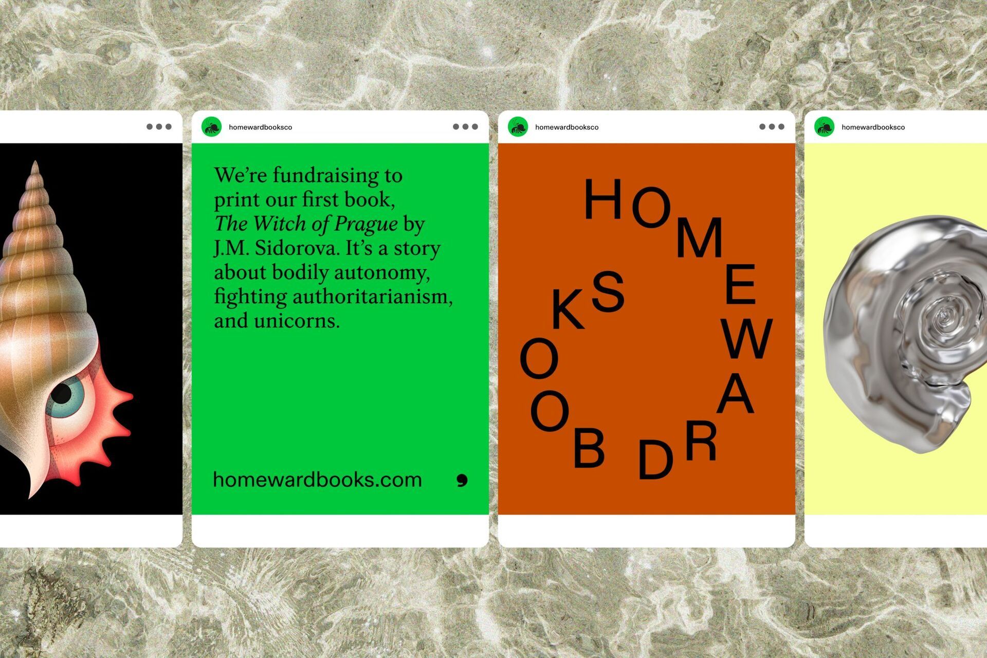
New Zealand illustrator Natasha Vermeulen brought Madame Bernarde to life, and Emma created our logo: the crab’s shell, which doubles as a punctuation mark when you need one. Our eye-shell illustration is by the Georgian artist Ana Miminoshvili: the perfect blend of the familiar and the strange.

Our Imaginary Object reward is delivered on custom postcards. It’s luck of the draw which you’ll get, but a third of them are Ana’s amazing shell eye illustration, and the other two thirds will come with the covers for our first two books. About which…
Finding the right cover for a genre-defying book
The cover for The Witch of Prague was always going to be a challenge. Our protagonist is a teenage girl, but it’s not a young adult novel; it’s set in Czechoslovakia in 1968, but it’s not a historical novel, either. How to convey its genre-bending nature?
Emma found the Armenian artist Khoren Matevosyan, and we were over the moon when he agreed to design our cover. When we sent over a few ideas for it, we were adamant about one thing: no unicorns. Yes, there’s a unicorn in the book. But a unicorn on the cover – that would make it look too fantasy-ish, right?
Khoren proved us wrong.

“I knew from the start that I wanted to explore scale,” says Emma, “the idea of what is real or imagined. Real tanks or toy tanks?
“I wanted the finished illustration to elicit curiosity and invite readers in—readers who might otherwise dismiss a book that presents as fantasy, because ultimately the story is timeless and universal.”
Turning a manuscript into a book involves carefully laying out each page. We debated whether we needed a dinkus. About whether it would be weird or fresh to have a running footer instead of a running header. About how wide the margins should be to make each page easy on the eye.

We’re so proud that this book has already brought income to artists and designers in different corners of the globe. That’s one of the reasons for Homeward’s existence. Our book supports not only the long toil of a writer, but also the other artistic disciplines necessary for creating an object.
We’re almost ready to reveal our second book, and we’re super excited to show you. Right now, it’s with a bunch of advance readers, and they keep sending us notes about how much they like it. We’re hoping to open up pre-orders for the Secret Second Book very soon. To get there, help us get The Witch of Prague fully funded!
We’d love to hear from you!
Endless fundraising appeals are not the reason why we started Homeward, but we really want to pay all these amazing writers, artists, and designers what they’re worth.
Even though it probably offends Madame Bernarde’s finely honed sensibilities, we’re going to point you one more time to our Kickstarter campaign.
And as always, please get in touch! You can contact us at [email protected].
